
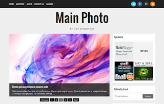
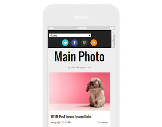
Main Photo responsive Blogger template
is my first responsive Blogger template with minimalist and clean
design. I create this template for photography or gallery blog
Features of this template :
Features of this template :
- Responsive blogger template both of desktop and mobile view
- Support Template designer. You can edit the background image, font family, font size, font color and others in Template Designer
- Featured image slider with auto recent post per label
- Minimalist and clean design template
- Compatible with modern browsers
- 2 column template
- 3 column footer and more
I don't set up the menu navigation. You can create it as you want. for the search box and subscribe via email, it's a default from Blogger. You can add it from Layout section.
Setting Main Photo Responsive Blogger template
1. General setting
Before install this template, make sure to change the mobile view.
Go to Template > click the Gear icon > click Yes. Show mobile template on mobile devices. > choose Custom (please see the image below)

* this setting recommended if in your current setting for mobile view is No. Show desktop template on mobile devices
2. Setting Featured Image Slider
This template support image slider with auto recent post per label/category. You just need type the Label name in widget section.
Go to Layout > click "Edit" Looped Slider widget

* Case sensitive. make sure you write correctly
3. Setting social networks
Go to Design > Edit HTML > Proceed and find this code below :
<div class='network'>

<ul>

<li><a href='https://twitter.com/ireng_ajah'><img
 alt='Twitter'
src='https://blogger.googleusercontent.com/img/b/R29vZ2xl/AVvXsEg7hv7KPRHqE39j_LCALZk0BjRyoK6OT_wO19IvWbgrR8g3DV5DFH5OsV9k7QIw7wn_7fAZ5VBn78EI23T_JAnr359CLuWIWaxxPn981GXQ84U4pcW-TMjQf7seqVRPFBiP4pc6Ll3nlp70/s1600/twitter.png'
 title='Main Blogger on Twitter'/></a></li>

<li><a href='https://www.facebook.com/MainBlogger'><img
 alt='Facebook'
src='https://blogger.googleusercontent.com/img/b/R29vZ2xl/AVvXsEi6Ke4F68fZ4wj07r5JKVf9fefJ14dqA0zcweCvrL_Qd3h3yJJTnDJ7ZGrwoC0MR7NIHY2u4SEOJenu138kh9r0v_6kHqAhMEV3PFKTKV_ErdbOvG2GWdYTcA79eZzPNFIfj8QDYimnHl5R/s1600/facebook.png'
 title='main Blogger on Facebook'/></a></li>

<li><a href='https://plus.google.com/111461490683022468168'><img
 alt='Google+'
src='https://blogger.googleusercontent.com/img/b/R29vZ2xl/AVvXsEjGIAFNlgpgbzePKlG9bCq4htk6-Bben5Kdx6yOffHJUvfHR5VYeeOOBdNcNpVuE5RDcAIzbov6PURNgY0C082XwYrwJ4WQx6NXvfam43O5hTMFM7zu5n9g-rWnEjRlOA1Oqf8RixQuSRYE/s1600/gplus.png'
 title='Main Blogger on Google+'/></a></li>

<li><a href='http://feeds.feedburner.com/mainbloggerz'><img
 alt='RSS Feed'
src='https://blogger.googleusercontent.com/img/b/R29vZ2xl/AVvXsEg0rM9dOXVlBt7OUm9_JtK5TEEfu3euAEmwRAldCu8t3C8POF4AYvn7NrdBFiB4ejsyQeCZL4teOGTOKxP3R4OhypWSe933sdhLsaPBPQ6wMu0Oq_Y1BqbbAAtTfG0ouaUxTqfvYTiFIINN/s1600/rss.png'
 title='Subscribe RSS Feed Main Blogger'/></a></li>

</ul>

</div>
Replace : Red color with you social and RSS feed links
4. Setting Menu navigation on Bottom
Go to Design > Edit HTML > Proceed and find this code below :
<div class='creditl'>

<ul>

<li><a href='/'>Home</a></li>

<li><a href='/p/about.html'>About</a></li>

<li><a href='/p/advertise.html'>Advertise</a></li>

<li><a href='/p/contact-us.html'>Contact Us</a></li>

</ul>

</div>
Replace : Red color with link and title menu
5. Setting Banner Ad 125*125px
For perfect view, the structure of banner ad 125*125px should be like this
<ul class='ads'>

<li>YOUR_LEFT_BANNER_CODE_HERE</li> <!-- Left banner  -->

<li class='last'>YOUR_RIGHT_BANNER_CODE_HERE</li> <!-- Right banner  -->

</ul>
6. Setting Widget on Mobile
To display widget on mobile or/and desktop, you can add these codes
mobile='yes'

mobile='no'

mobile='only'
For example, you want to add Popular Post widget. Default Popular Post widget look like this :
<b:widget id='PopularPosts1' locked='false' title='Popular' type='PopularPosts'/>
Then, you want to display on mobile too. So, the Popular Post widget code will be like this
<b:widget id='PopularPosts1' mobile='yes' locked='false' title='Popular' type='PopularPosts'/>
For more detail, you can see on this post
http://code.blogger.com/2011/11/introducing-custom-mobile-templates.html
* By downloading and using this template, you agree with our Term & License
* Don't forget to check the demo live on you mobile


Saya sangat berterimah kasih banyak kepada PAK MANDALA atas bantuannya saya bisa menang togel, saya benar2 tidak percaya dan hampir pingsan karna angka yang di berikan beliau ternyata tembus. awalnya saya cuma coba2 menelpon, saya bilang saya terlantar di daerah Malaysia. kerja sebagai TKI dan tidak ada ongkos pulang, mulanya saya ragu tapi dengan penuh harapan saya pasangin kali 100 lembar dan ALHAMDULILLAH berhasil. sekali lagi makasih banyak ya PAK… dan saya tidak akan pernah lupa bantuan dan kebaikan PAK MANDALA. kepada saudara yang ingin merubah nasibnya seperti saya silahkan Hub 0823"4898"5714 PAK MANDALA. Demikian kisah nyata dari saya dan ini tanpa rekayasa. INGAT. kesempatan tidak akan pernah datang Yang ke.(2).kalinya…!
BalasHapus